Tag Archives: self improvement

Use Your Company’s Image as a Personal Asset

Have you ever wondered why some people move up the corporate ladder quickly, while others consistently get passed over for promotion? Or why certain people do so well in sales? Yes, education, talent and people skills are major factors, but image also plays a major role.

Most companies spend a lot of money each year developing and maintaining their company image. As a representative of your company it’s up to you to reinforce this image by presenting yourself in a way that’s consistent with the company brand. Let’s face it, when we meet someone for the first time, whether we like it or not, we instantly form an impression about them. If the impression matches what they are trying to communicate, we are more likely to trust them. Once trust is established, it’s easier to build rapport and strong business relationships.

Why Use Shiny or Frosted Make-up Finishes?

Shiny and frosted cosmetics have a similar affect to light coloured make-up. They enhance or bring out the area on which they are applied. To maximize this effect, combine the two qualities – light and shine. Light make-up colours that are frosted or shiny will make an area appear even more pronounced.  The facial feature where it is applied will appear larger and visually push out more than when applying a light matte cosmetic colour. This maximum effect will also cause the area around it to appear flat or sunken in comparison. This can work wonders to enhance the lips, cheek bones, eye lids or brow bones.

Use Colour to Harmonize or Dramatize

When applying make-up, colour can be combined in various ways to create different results. Color can create a harmonizing effect by enhancing an individual’s natural colouring. It can also create drama.

  • Similar colours harmonize
  • Contrasting colours next to each other emphasize one another and add dramatize
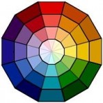
  • Applying a colour on top of its complementary colour (opposite colours on the colour wheel) will neutralize both colours.
  • Light and dark colour worn side by side will dramatize the facial features making them appear more pronounced.

Highlight Your Facial Features

Make-up application relates to the actual structure of the head and face.

The natural hills and valleys of the face can be recreated or enhanced with optical illusions created by using light and dark cosmetics.

Highlighting is the application of a make-up colour that is lighter than the surrounding area. This area will appear more pronounced than the area next to it.

Choosing Your Colours

The easiest way to achieve natural looking results is to choose your make-up in light tints, dark shades, and muted tones rather than clear, bright hues. The more muted the colour, the more neutral it becomes.

  • Neutral colours are the most versatile and work well with most skin tones and eye colours unless you are very fair or very dark. e.g. browns, black, greys, tints (off whites), etc.colour wheel
  • For more drama, when working with eyes, choose a tone from the colours opposite your eye colour on the colour wheel. e.g. Blue eyes – coral, peach, pink and yellow tones.

Handshakes

When meeting and greeting for the first time, be sincere, stick to the rules of etiquette and be sensitive to the person’s strength.

Make eye contact, smile and shake hands, repeating the person’s name in the greeting. For example:

  • “Hello Mary. It’s nice to meet you, I am …;hands
  • Or ‘It’s a pleasure to meet you.”

The most formal greeting would be

  • “How do you do, Mary, I am…” The reply to “How do you do.” is “How do you do.”

If you would like to meet someone, when approaching that person:

  1. Make eye contact and smile.
  2. Introduce yourself with your first and last name.
  3. Shake hands firmly, web to web. Lean into the handshake. Hands should be vertically parallel.  Shake hands 2-3 pumps.

This shows confidence and sincerity

Handshakes to avoid

  • The bone crusher – some people have no idea how strong their grip is.
  • The limp handshake (sometimes called the dead fish) – gives a non-confident, wishy-washy impression.
  • The power grip (when someone grips with their hand on top) – in body language this indicates that the person perceives themselves as more important or is trying to get the upper hand.
  • Gabbing the finger tips sometimes very softly-  this can be a cultural difference not unusual on some Asian cultures – in western society we prefer a web to web handshake

These handshakes are a bit too friendly for business. You may be perceived as coming on too strong. Better to be saved for friends and family.

  • 2 handed handshake (when you cup both hands around the other persons hand) – is very nurturing and friendly.
  • Keep your hands to yourself. Avoid shaking hands while holding the other persons elbow or shoulder – too friendly for business

For another way to get a grip on your handshake watch the video on Living Vancouver with host, Jaeny Baik and Kimberly Law, AICI CIP. Click on Watch the Show in the top menu and then on It’s a Living in the right column.

Why Wear Matte Make-up

Matte cosmetics appear flat on the skin. A dark matte product will absorb more light than a dark frosted colour, making the area appear more receded. A matte light colour will appear flat on the skin compared to a shiny, light colour.

Use medium to deep make-up colours with a matte finish on facial areas that you which to look pushed back. This application applied under the cheek bones, in the crease above the eye lid and other areas will add definition to your facial features.

Are You Into Orange?

Orange is one of the popular fashion colours for Spring 2012. But most of us either love it or hate it. If you love orange or love the idea of orange in your wardrobe right now, you may be in an orange phase.

The ORANGE PHASE is a social phase. Bright orange is the colour of enthusiasm and energy. It is emotionally and physically stimulating for the wearer and those who see it.

When wearing orange, it is a time of informality and close times with friends and family. People in an orange phase are open to new ideas and generally are in a happy time.

orange

Because of the activity and forcefulness inherent with the colour, orange phase people can be overwhelming and often appear to take over in group situations.

Orange also represents a most vulnerable time: as the personality of the person is so open at this time, feelings are easily hurt. These people erect no emotional barriers. It is a non-threatening time, and people in this time are best friends with whomever they are with at the time.

If orange isn’t one of your most flattering clothing colour, add a little orange to your wardrobe in the form of an accessory. Bright orange doesn’t come around in fashion very often. So if you love orange, this is the time to wear it in your wardrobe… with confidence.

For more on the advantages of wearing bright colours see “Bright Colours Get Things Done”.

Fashion Cycles – But Do We?

If you are heading for 50 like I am and think you have seen every style in fashion come and go… you probably have. Fashion does move in cycles and over time what may have been considered old and dated… just a few years ago, suddenly becomes new again. Yes, with a little tweeking on the part of the designer, fashion trends do come back again and again.

But before you dive into your closet and dig out all those gems you loved and charished way back when, consider the following:

  • Is it comfortable?
  • Is it still me?
  • Does it flatter my shape?
  • Is the colour flattering?
  • Does it coordinate with anything in my closet?

Fashion styles may move in cycles and come back into vogue again and again. However, as human beings, we evolve and change over time. Before putting on that outfit you wore faithfully in the 1970’s or 1980’s, think about who you are today. Even though the fashion style may be similar or the same as the good old days… it is likely you aren’t.

7 Reasons to Strategically Colour Your Wardrobe

Last year for Valentine’s Day, I wrote a post called “Look Gorgeous in Red on Valentine’s Day”.

Wearing colours that suit you will instantly make you look healthier and more attractive. As an image consultant, determining the most flattering colour qualities for my client, is one of the first things I like to focus on when we work together. Why, you ask??

  1. Easier shopping for clothing and make-up
  2. Mistake proof clothing colour coordination colour wheel
  3. Faster dressing at home
  4. Easier packing when traveling

These are all great reasons. But the reasons my clients tell me they are happy they know their best colour qualities are:

  1. Avoid mistakes!
  2. Save money!
  3. Sparkle!